I am thinking a lot about the importance of value at the moment. I think most people who have ever spent any time trying to paint realise that it is a hugely important topic but the monochrome studies I am doing at the moment are really reinforcing the crucial role they play in a picture.
Values as a tool in composition is a huge subject and one I have spent an enormous amount of time investigating but for the moment I am talking merely about value as a means to acheive greater realism.
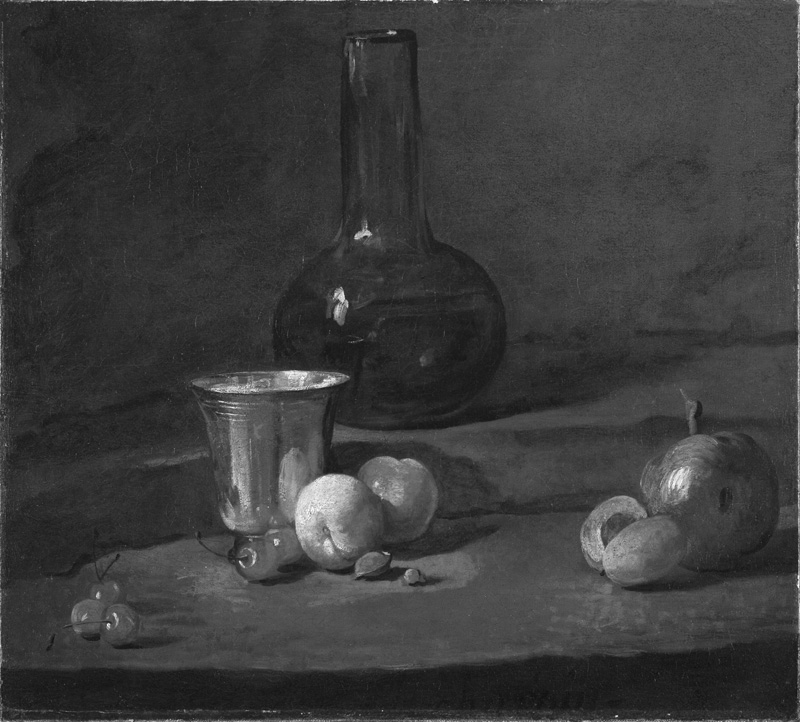
Have a look at this picture by Chardin from which I have removed the colour. We have only values to work with but can anyone doubt the fact that the bottle is glass and the goblet made of a shiny metal? This demonstrates the vital nature values play in giving us a sense of reality in a picture.
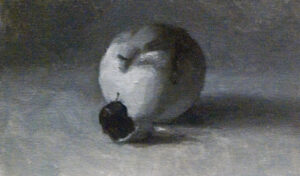
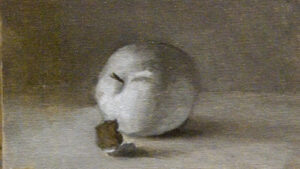
So following on from my study of two apples I have painted two versions of this single apple to conduct the little experiment which I hinted at before. Here I have done one version using the full value scale trying to match the values as I saw them. This will later (again guided by Paul Foxton) be coloured with opaque paint using the monochrome to make sure I match the values accurately when adding colour.
But I have also painted a second version, (below) slightly lighter, painted with raw umber, (hence the shift in hue), and this I will use as a base for an experiment with glazes and scumbles, ( that is transparent and semi-transparent paint layers) Hopefully this wll give me the scope for greater variety in the colour and a richer more interesting finish. The addition of such layers will, however, lower the value, hence the lighter underpainting, but whether I am skilful enough to really exploit the full range of oil paint and produce an image with more interest and depth than the purely opaque, solid colour version remains to be seen.
Of course the real prize for mastering this method of colouring is not in the painting of simple objects like fruit but in the trickiest of all subjects, (I think) the human face and form. This is the subject matter where such a range of handling really comes into its own and can be exploited to greatest advantage. Almost all the great painters before the middle of the nineteenth century built up their portraits in many layers so if you want to try to emulate the master works of the rennaissance and baroque periods you need to be able to understand this technique.
On the other hand, I am not a great master and we have to learn to walk before we can run, so fruit it is for now. I’ll post the two finished pictures next week so you’ll be able to see how I’ve managed it. So I must finish with my confession as promised and that is that I used to be very hung up on technique and I have wasted an inordinate amount of time trying to experiment with advanced methods before I was really ready for it. In the process I have caused myself great confusion of the brain and frustration enough to last several lifetimes. One thing I have learned though as a result of all that is that the simplest way to the required result is the best way. Complications are to be avoided unless they bring positive benefits to your finished work. Which is as much to say that if all the clever scumbling and glazing doesn’t result in an apple noticeably more inviting than the simple opaque one then, well, simple opacity will be the way forward.


