
As an artist I found that when you start learning to paint one of the first concepts you have repeatedly drummed into you is the importance of something called “edges”
Well, you are fairly certain you know what an edge is, its where an object ends, and where another object, or just some empty space begins. But its not obvious, or at least it wasn’t to me why these areas should be treated in any particular way. Some clue is given by the common division of edges into 3 main categories; hard, soft and lost, but I have to confess, it is only now after many years of painting that I am really starting to get to grips with the whole complex issue of edges and to understand what a crucial role they play in realist painting.
I had been thinking of edges as a problem, but it is better to think of them as a tool, one weapon in the painter’s armoury to help produce what we all aspire to in a painting, a harmonious whole. Now the whole idea, once so ubiquitous, that the eye can be led around the picture has now been debunked, ( I will write more on this at some point because it is important) but edges remain a method to control which parts of the picture the eye rests on and which part it glides over.
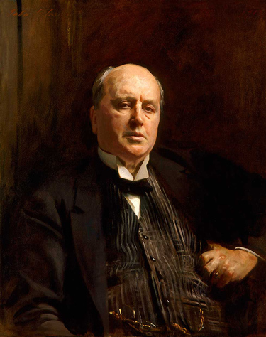

I have been painting a bit in monochrome recently and in this case clearly you only have value to work with. Two areas of highly contrasting value will give a hard edge, adjacent values will give a soft edge and identical values will produce a lost edge entirely. An edge can further be softened by literally blending with a brush whilst the paint is wet but there is a danger it seems to me of overdoing this and producing a rather unpleasant “wooly” effect. If you look at an artist like Sargent for example he would lose an edge entirely by frankly painting an identical tone across an area where two objects meet.
Another way of losing an edge which I really want to explore is by closely matching hue or chroma. This method I think was used more by the early painters especially in the north of Europe. Artists such as Van Eyck and Memling wanted to keep the stained glass like quality of their individual colours but also have a feeling of breadth across the painting and not have the figures “stuck on” to the background. The way the green of the dress of the left hand figure is carried through into the foliage behind softens the edges of the red between the two, and to help this the red is kept at the same chroma to prevent any jarring of the eye whilst still giving a pleasing sense of variety. Also it is not an accident that the marble panel in the colonnade behind the figures are red at this point but change to near black behind the figure on the right wearing black just to lose that unimportant edge.
So to cut a long story short, I think there are two ways of playing with the variety of edges which I really want to explore. one with value and one with hue and chroma. One where the edges are literaly softened with a brush and one where the colour areas remain distinct but appear fused becasue of well matched hue, chroma or value. It sounds simple (actually I’m not sure it even sounds simple!) but there is such a lot to unpack there, so many different ways of achieving the same end, a beautiful harmonious picture.