The problems of colour are many and varied right? So it makes sense to try and tackle them in some sort of order, to jump one fence at a time as it were rather than tackle everything at once.
That’s one school of thought anyway. In modern times, say since the middle of the nineteenth century it has been very common for artists to attack their pictures in one go “au premier coup” as the French say, but before that date it was more usual, for finished work at least, rather than sketches, to paint in layers, to approach the final image slowly in stages.
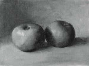
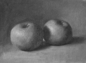
In this painting I started with a monochrome version of the apples, and having let that completely dry, then added the colour on top. Usually when this is done the base layer monochrome is deliberately done a little lighter in value. This is because the colour would then be added with some transparent and semi transapent colour and this would inevitably darken the overall image taking it to the required value when finished.
In this case however the gray version was done at a value which seemed correct and the colour added opaquely. Opaque colour can lose some of the beautiful qualities that thinner paint can have, but the great advantage is you can mix your colour and check it precisely on your picture because you know exactly what value you need.
I found this very interesting and enjoyable, it is painting with a safety net but there is no harm in that. The result is what matters and the artist must choose the best method to arrive at the right results. Another great advantage is, thanks to the magic of Photoshop, I can compare the values of the finished work with the underpainting to see how far I strayed from my given values. What we get is this:
On the left is the original monochrome and on the right a desaturated version of the image you see at the top of this post. On the whole I think that’s not too bad, perhaps the light side of the near apple has lost a bit of value, that may have happened as a result of having more time to blend the colour, but overall its pretty close.
So what have we learned? This: that if the values are good the actual colour is of secondary importance. Having that solid secure base of a good value structure allows you more freedom to attack the application of colour. This is certainly a method I shall spend more time exploring. I should close with a thanks to Paul Foxton a wonderful artist and teacher who guided me through this process.


