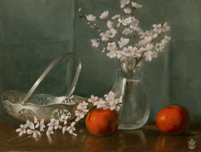
I painted this picture recently which I have called Blossom (9″ x 12″ oil on board) and as it is a more complicated arrangement than most of the little studies I have been doing lately it made me think again about the subject of composition and how essential it is to making a good painting
I have been watching a lot of videos on Youtube recently about the art of composition and I have seen one idea come up time and time again which I am sure is a misunderstanding, and that is the view that “composition” consists chiefly of the placement of objects within a picture. Related to this is all sorts of stuff about the “rule of thirds” , the golden section and even esoteric talk of Fibonacci numbers, the belief being that all these secrets of the ancients can guide us towards placing the objects in a picture in significant and meaningful areas, and having done so our picture will be “composed”
Now I hesitate to say that all this is complete bunkum, but it seems to me that all this “secret knowledge” can be summed up thus. “Don’t put your main areas of interest smack in the middle or right on the edge” Worth remembering should you be tempted to do so but even this “rule” could be broken by an artist who knew what they were doing, so it doesn’t really merit the time spent on it. More importantly I feel it is vital to understand that composition isn’t this. Of course you want to arrange things pleasingly but what makes a picture succeed or fail is not what objects are depicted or even where they are positioned but how the whole works as a piece of colour, how pleasingly the different areas of colour work together.

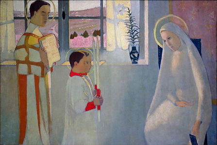
Maurice Denis (1870-1943) a French painter and member of the group called the Nabis (from the Hebrew for Prophet) once wrote “Remember that a painting – before it is a battle horse, a nude model, or some anecdote – is essentially a flat surface covered with colours assembled in a certain order.”
It took a while for the importance of this to sink in for me, I am not a great fan of Denis’ flat poster like work (though he understood colour as this picture shows) and at first I resisted this quote because I thought it merely a justification of a style of painting I didn’t particularly warm to. However I came to realise its importance for all painters, even the most fervent realists, because however nuanced and subtle your work it can’t escape from the fact it is in reality just, as he says, bits of colour on a flat surface. Therefore the problem of composition, comes down to finding that “certain order” of colours which is most pleasing. In the picture above Denis wanted some spots of high chroma red near the centre and found a way of getting it there by means of the altar boys holding the candles. He could have put flowers or anything else and the composition would remain essentially the same. What those bits of colour represent is, it seems to me, of secondary importance which is why we can be moved by a picture of Van Gogh’s old boots, Gwen John’s chair or the contents of Mrs Chardin’s pantry just as much, or lets say very nearly as much, as by the creation of man or some other inherently profound mythical or religious subject.
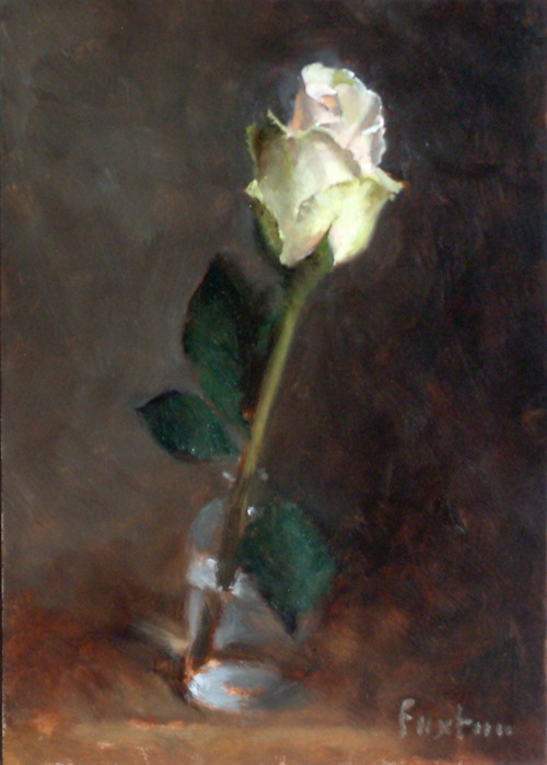
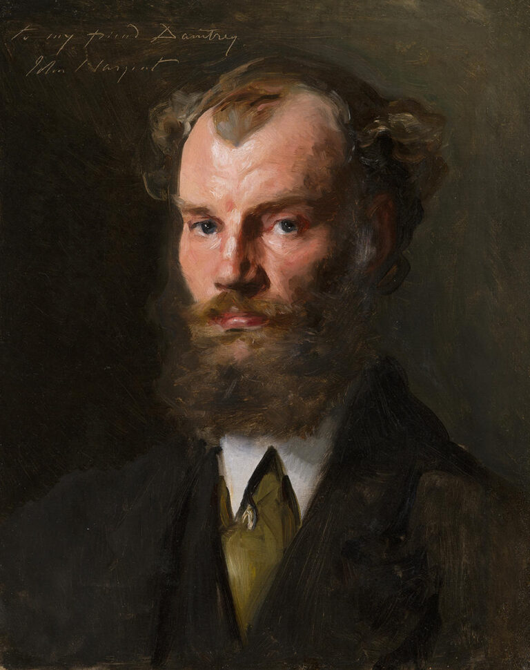
To illustrate the point further, here are two pictures of very different subject matter which have essentially the same compostion. They are both pictures consisting of a small light area against a larger dark area, the main light and darker background both low in chroma but with a smaller scattered area of slightly higher chroma (green in both cases) So simply is the rule of having dominant and subordinant areas of each of hue, value and chroma established.


Where these areas are placed does not need to be the study of hours, most of us do this fairly instinctively there is no great mystery to it. Ruskin said of Rossetti that he could design a picture as easily as drinking a glass of wine and in terms merely of placing objects I think that does actually apply to most artists who have had even minimal expereince. The secrets of compositon do not lie here.
So to fully understand how to compose we have to remember that when Denis says “colours” we have to deal with each of the three elements of colour; hue, value and chroma, and although every touch will contain within it all three aspects we need to seperate them in the design process. This means we have to ask ourselves of every touch, how does it affect the balance of hue, of value and of chroma? is it part of my dominant area or subordinate? is it in the lead role or part of the chorus? Introducing objects can be done to help this process, say I want a bit more red/yellow in my still life to sing against a blue background I put in another tangerine. I need a bit of green in a portrait to offset my sitter’s ruddy complexion I ask him to sport a tie or shirt of the appropiate tint and then perhaps I decide to reduce the chroma so it doesn’t sing out too loudly and distract form my centre of interest. I have slowly come to realise that this is the art of composition, arranging my colour notes to form a pleasing whole which has on the one hand, enough unity to hang together as a single composition and on the other, enough variety to catch and maintain the viewer’s interest.
There is so much more to say on the subject but that’s enough for one post. Next time I will say a bit about the added difficulties of composition for the realist painter and the one element of composition which I have discovered to be the most important of them all.


Dear David I can’t agree more, the composition is the notes, the partition but the harmony of the melody is given by the vibration of the colours.
Thank you David, a very educational read for one just stepping into this world. Shall remember and experiment with how not to make a color sing too loudly, I think a common faux pas by a new artist.