We’ve all been told a thousand times that there are no “rules” in composition, no real rules anyway, nothing absolutely imperative that will have the painting police banging at your door if you infringe them. Well that’s true as far as it goes but suppose I told you that it’s not quite the whole story…
Let’s accept then that we are free to paint what we like, how we like, but we want to make successful pictures right? pictures that will give pleasure to the spectator, maybe (we can dream) for centuries to come. Well some people have done that, we call them old masters and their succesful pictures are hanging right now in the galleries and museums of the world. It doesn’t seem too outrageous to me to say that if we want to compose good pictures we should look in the museums and try to learn from the experience of others.
And what we learn from an intelligent study of great art I think, is not what we have to do, but rather what works. The “rules” are really only the distillation of centuries of experience. And here is one thing (of many) I have noticed; all the paintings I admire use a limited variety of chroma. That is not to say the range isn’t very great, it usually is, from neutrals to full chroma, what I mean is there is a clear dominant chroma and a subordinate chroma and not a lot inbetween which would have the effect of muddling the composition and weakening the oppositon between the two groups.
Take a catalogue of a gallery such as the National Gallery in London and flick through it very quickly, the over-riding impression will be of a sort of warm brownish grey.
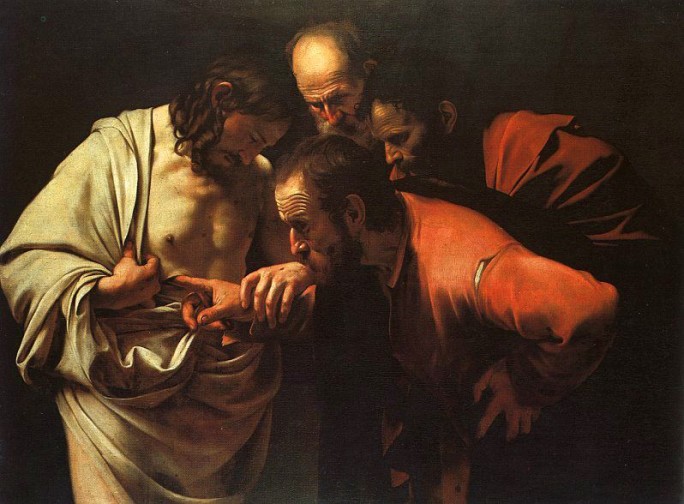
Here we see that colour established as the dominant chroma and the relief is the red of the two apostles’ tunics, not really very high but appearing more so because it is surrounded by near, or actual, neutrals. Observe though that this relationship which helps give the picture its force is not weakened by any intermediate steps or areas of colour. This is what I mean by saying many great pictures use only two (more accurately, two narrow groups) of chroma.
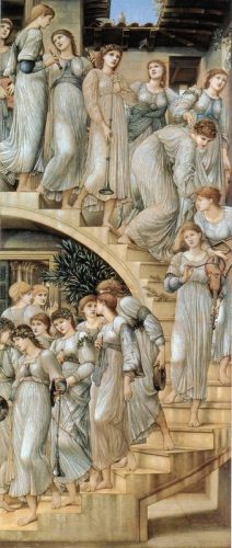
To take another more subtle example this picture by Burne-Jones is almost entirely painted in very low chroma colours, in Munsell terms perhaps chroma 1 or 2. But observe the little area of higher chroma blue in the sky, how cleverly that offsets the rest and gives it balance. If you put your finger over this area I think you can feel the difference. But again any intermediate steps would destroy this very subtle interraction.
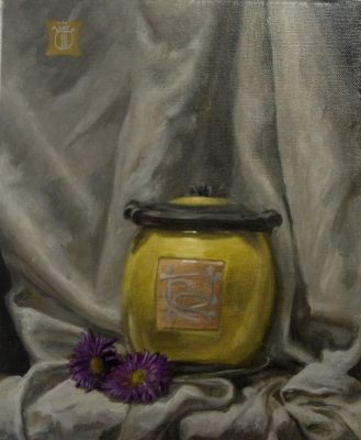
So to my own work, trying to put these principles into action. I painted this little picture some time ago and was reasonably happy with many parts of it. I had been careful to establish my near neutral “white” cloth as the dominant chroma against which the yellow pot could sing out. The little purple flowers were intended to enhance the yellow by their contrast. But initially I made the mistake of painting the flower heads in a lowish chroma which united neither with the cloth nor the pot.
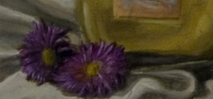
Just recently therefore I spent 5 minutes raising the chroma of the flowers with a couple of glazes to bring it up to the level of the pot. The result, as I think you can see above, helps the breadth or unity of the whole piece by reducing the chroma variety whilst at the same time providing contrast through the complementary hues.
So now I always try and incorporate this observation into my painting; to have clear dominant and subordinate chroma areas and not to weaken that opposition by having too many (ideally any) intermdiate steps. In fact I find it helpful to apply this practice to both hue and value as well, but that of course is where it starts to get tricky!..


