Hang on a second ! I hear you cry as one, surely we all know that there are no “rules” about colour harmony and how to create it in a picture, after all every attempt to lay such a rule down is quickly overturned by an example of a first rate picture that breaks it.
However I am going to put my head on the block and state that there is one golden rule for colour design and here it is. Drum-roll please. The three elements of colour, the three characteristics which every dab of colour must have which are hue, value and chroma, must be treated seperately in the design process.
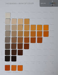
There we are, but what does this actually mean? First of all let us define our terms. This image is of a page from the Munsell Big Book of Colour and shows one hue,(colour in layman’s terms) in Munsell terms 5YR which basically means a mid orange. All these different chips are of the same hue, from top to bottom the value decreases in regular perceptual steps from light to dark.
From left to right we see an increase in the chroma from near neutral on the left (chroma 2 in munsell notation) up to the maximum possible in paint. In this case that maximum is chroma 14 which in this hue is reached at values 7 and 8. Different hues reach maximum chroma at different values and this is an important factor in design which we may touch on later but is not so important for today.
For now, rembering these three elements which have to be considered in design let us apply our rule. Now, a harmonious composition can be defined as “variety within unity” which is a fancy way of saying you must have enough variety in you picture to be interesting but not so much that it doesn’t hang together as a unified single image. This unity of surface is often referred to as “breadth”. Too little unity and the picture is incoherent, too much and it is monotonous. So, to avoid these two extremes, the rule is that each element of colour must have a dominant and a surbordinant area. The viewer must be able to see, or at least sense, that there is a dominant hue, value and chroma in the design but also to feel some relief from these dominant areas in order to guard againt monotony.
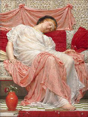
These same areas also provide the dominant and relief chromas, the reds being relativley high chroma compared to the near neutrals of white and grey
It is true that the cushions are higher chroma than the pink draperies but in this case they perceptually appear to be more related than they are because they share a hue and are both contrasted against very near neutrals. In terms of value the dominant note is clearly the high value which takes up most of the picture with relief coming from the darks of the cushions, her cap, the shadow under her seat and the vase. Thus the three dominances are clearly established and the three surbordinant areas give relief and variety without upsetting the unity of the picture.
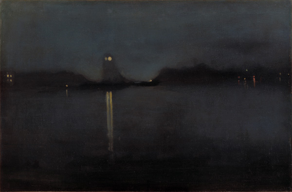
Let us take another example which is interesting as it illustrates what I think is a useful guideline. That is, unity is more valuable than variety or to put it another way, if in doubt err on the side of unity. This picture by Whistler, another beauty I am sure you will agree, appears to border on the montonous but there is in fact some subtle variation of chroma in the blue haze with some neutral near blacks breaking up the low chroma blues and providing both oppositional low values and (by virtue of being neutrals) chroma. There is nothing higher than about a chroma 3 here but in that context the neutrals serve as a seperate relief block. Further value and hue relief is supplied by the beautifully placed lights and their reflections. Its a daring picture by Whistler, just try blocking out the central light with your finger and see how it risks becoming boring and monotonous. Those small variations of hue and value make all the difference.
I am learning these lessons myself and I hope thay can be useful to you. Nothing guarantees making beautiful colour harmonies except a lot of practice and training the eye and mind. However this is a good tool I am sure for at least avoiding egregious errors. I always ask myself now if I have firmly established dominant and surbordinant areas for hue, value and chroma, it is surprsing how easy it is to overlook this especailly if you have fallen in love with a particular subject. Its a hard lesson to learn but nature is not a great composer, she needs help very often and I suppose we should be glad of that fact or else why would we need artists at all? As Whistler himself said,” To say to the painter that Nature is to be taken as she is, is to say to the player that he may sit on the piano.”
There is so much more to good colour of course than I can touch on here. Books have been written about it, but it is vital I am sure to keep the three seperate elements of colour in mind when designing. Perhaps it is wrong to talk of “rules”, but we can learn from the masters though, we have centuries of good practice to guide us and we can at least try and establish what works and why. I would recommend any learning painter to choose an artist or two whose colour really moves you and study him or her to see how they establish dominant and subordinant areas. I am sure that this principle of will be found to be a common thread in the vast majority of the best work of the past and indeed present.


