In case you thought painting was easy. I have to tell you a cautionary tale of a painter who failed to take account of his own compositional guidelines and nearly came a cropper as a result. It turns out that its one thing to know what you should do, but another to actually do it!
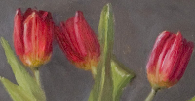
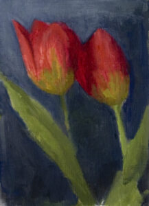
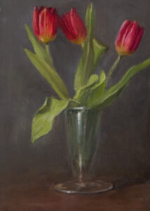
Of course, that painter is me. I painted this picture called Tulips (Oil on board 7″ x 5″) the final version of which you see below, and which in the end I am fairly pleased with but it was a struggle and at one point I was pulling my hair out in frustration because it just wasn’t working.
Anyone who has tried to paint a picture of any sort will be familiar with this feeling. The individual parts seemed ok, but the whole just didn’t move me or inspire me in any way. In truth it didn’t grab my attention. A painting is made to be looked at, whatever other qualities it has it must be pleasant to look at, in the same way that a piece of music must be pleasant to listen to, but mine, frankly, wasn’t.
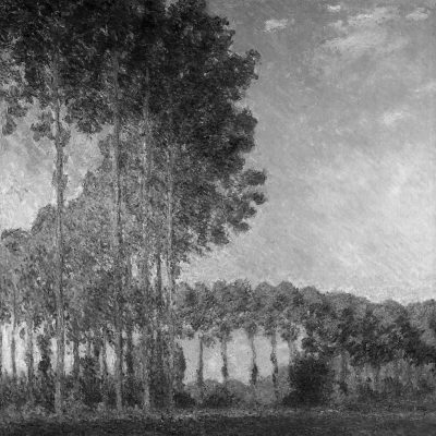
So, as I started to say in my last post, the culprit in these instances almost always are not the parts of a painting but the whole, the “ensemble” so I had to look back and see where I had broken the guidelines which I usually use to keep me right. The key to making a painting it seems to me is the phrase “variety in unity” and the main tool we have to ensure we uphold this principle is establishing a dominant and a clear subordinate area for each of the three qualities of colour ie hue, value and chroma. Now to paraphrase the Good Book, there are three qualities, hue value and chroma but the chief of these is value. It is always said, and I agree, that there are no absolute rules in painting but the nearest there comes to being one surely is that a picture must have a clear value pattern to succeed. There may be a great picture out there which doesn’t follow this precept but I confess I don’t recall seeing it. It is most obvious, perhaps, in portraits and is the reason that so many portraits have a dark background against which the light face makes a statement. Even the impressionists knew its importance. We think of Monet as a colourist but his colour works only because he had a firm sense of values. Look at this landscape in greyscale and you can clearly see the major low value shape against the subordinate high value area. Of course some variety is usual within the major shapes but not enough to stop them reading as a single coherent whole.
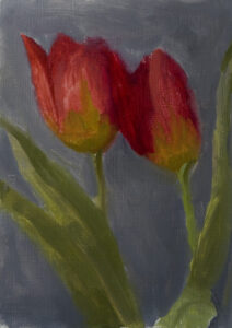
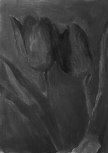
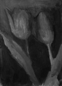
So when something doesn’t work and I am not sure why, my mantra is always “Check the value pattern”. Looking back at my first compositional design what had I done wrong? Well I confess I didn’t really like this little study on paper but I made the classic mistake of thinking that because it was so roughly done that the problem lay there, and if I just finished the parts more thoroughly and minutely the finished picture would be successful. I am almost certain that this is never the case. As you can see from the double image above putting my sketch in photoshop and extracting the colour made plain what I should have seen anyway, the value pattern was awful, in fact there wasn’t one! I had produced a thoroughly dull, very nearly a literally monotonous (one tone) picture. I tried to remedy this by making the background a bit darker as we see in this second version below and although it is slightly better I still don’t think it is clear enough which is the dominant value.
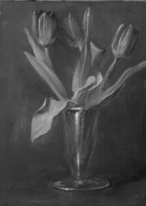
I realised I had to go back and redesign the picture making sure I established a clear dominant value. To do that I decided to pan back and paint the whole of the vase and flowers, that way I could use the background and table together to read as one value unit and I was careful to bring the shadow side of the tulips down to the same value which gave me the additonal advantage of being able to lose an edge or two. I realised also that the high chroma of the tulips against the neutral background meant they didn’t need to be so large to make a visual impact. Now I had a clear value pattern, as I said before I have found that it is easier to have a very unified value pattern and add a bit of variety, I find it doesn’t need a lot to make it interesting whereas on the other hand its easy to put in too much and finish with something which has no overall coherence.
So, the first golden lesson here is always check your values, its the scaffolding on which all paintings are built. And the second golden lesson is, always follow the first lesson! Painting is difficult, but sometimes,if you are anything like me, we seem to like to make it even harder than it need be!

